Vetta
Rebrand, marketing design, and photo retouching for a sustainable capsule-style fashion company.
Internship Fall 2020—Spring 2021.
Marketing


Rebrand
Objective
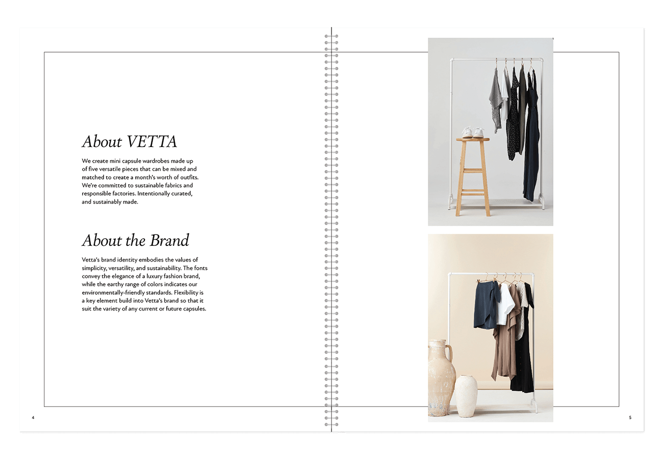
Since the company hadn’t had a designated graphic designer until I joined, there had never been a formal branding process for the company. My goal was to refine Vetta’s aesthetic into a more cohesive, mature brand aligned with other sustainable, higher-end fashion brands.
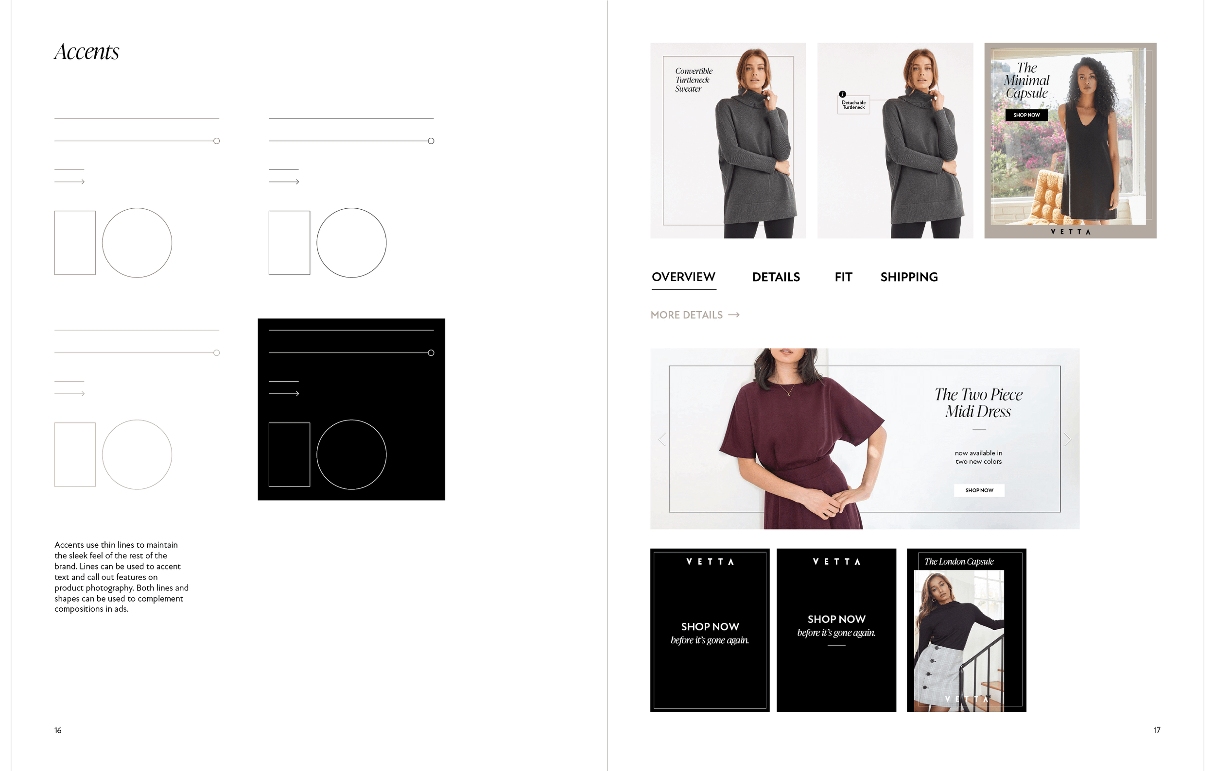
Brand Exploration
I researched several comparable brands in the same market space as Vetta, as well as consulting with the Art Director and CEO to articulate Vetta’s brand aspirations. We were looking for clean and elevated, while still somewhat approachable.
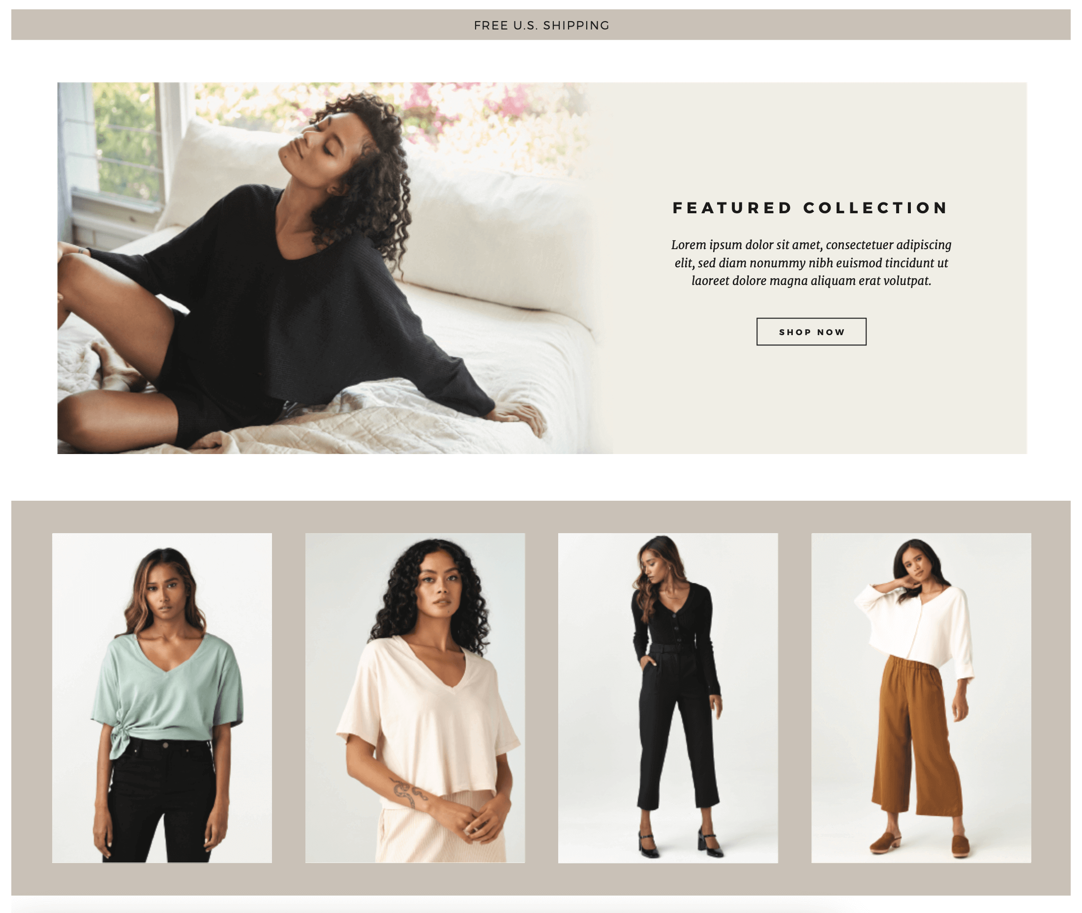
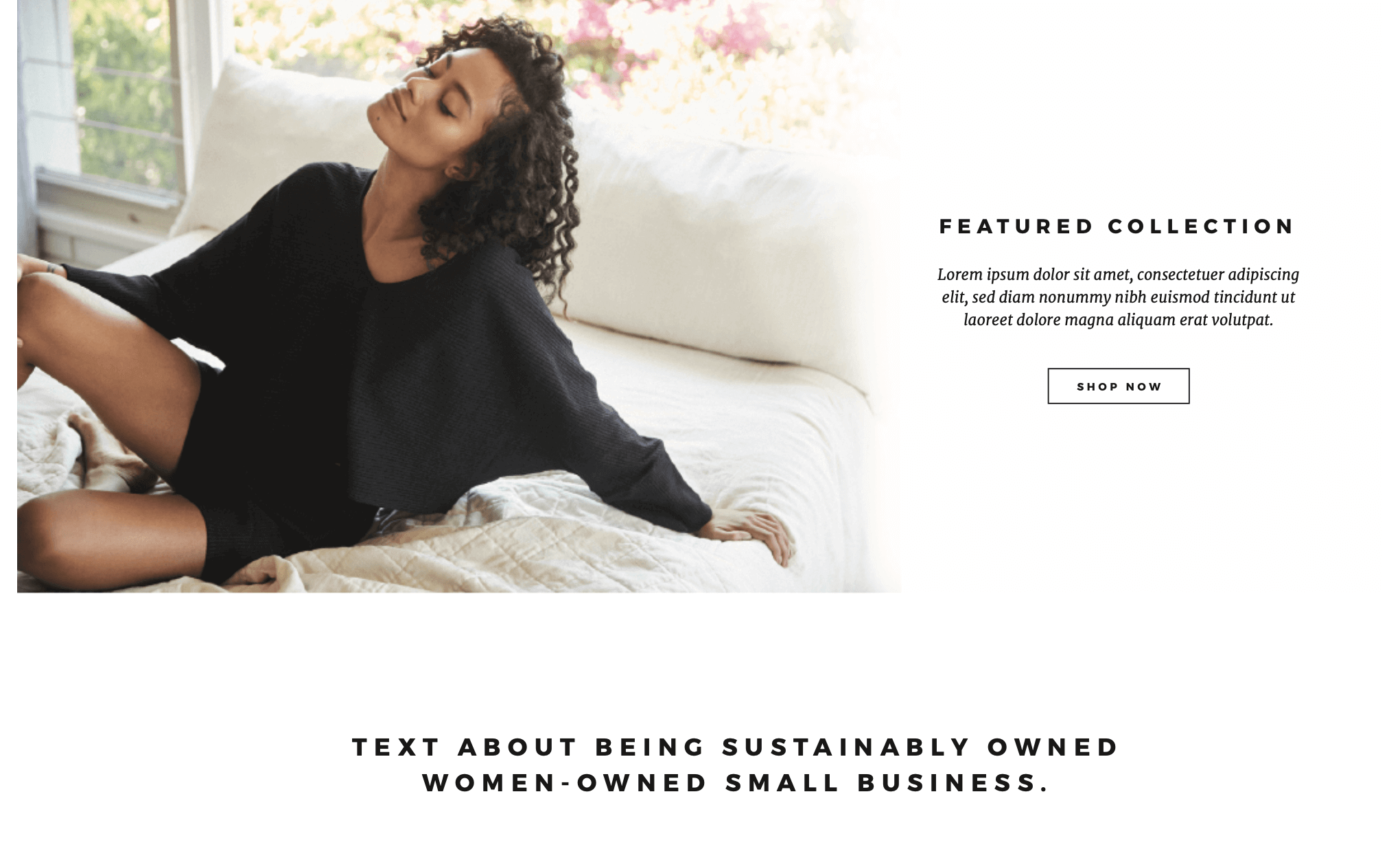
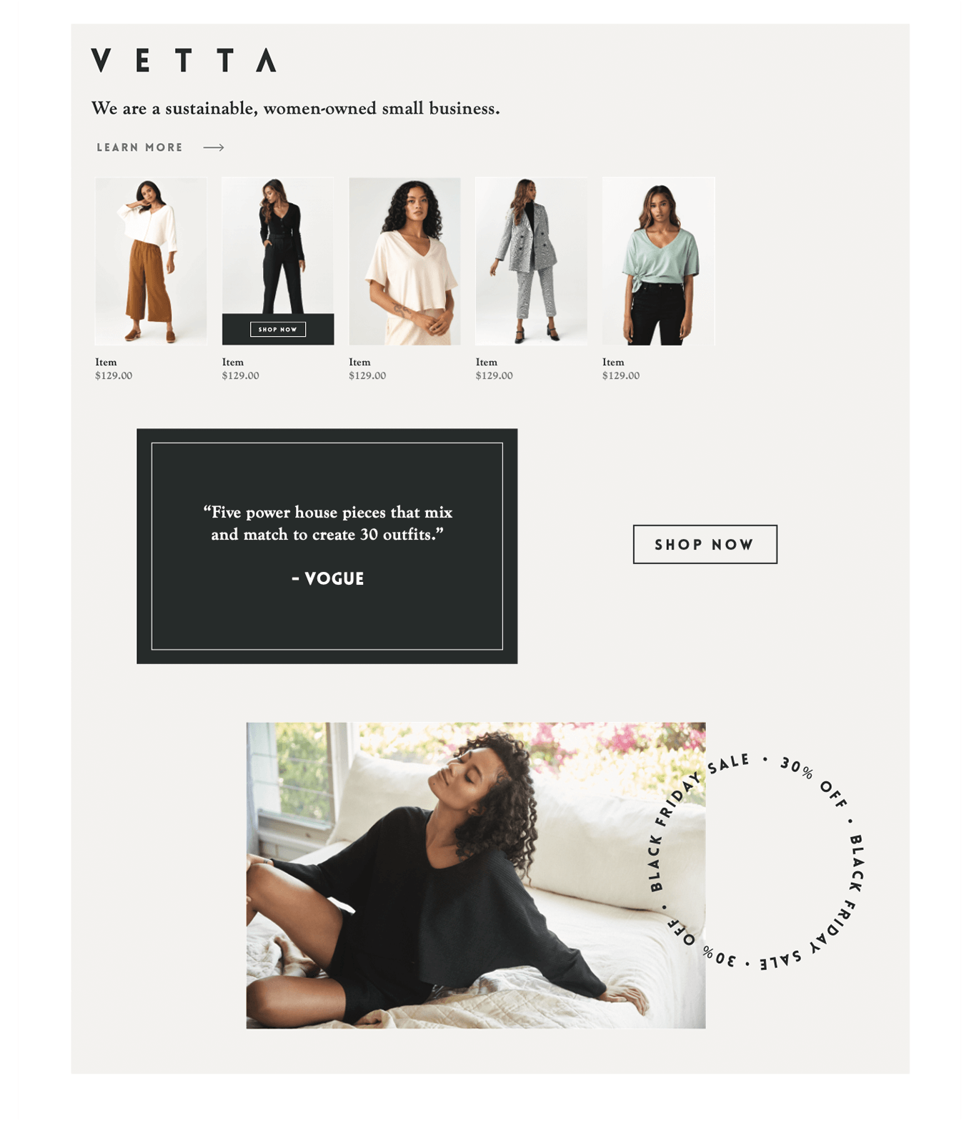
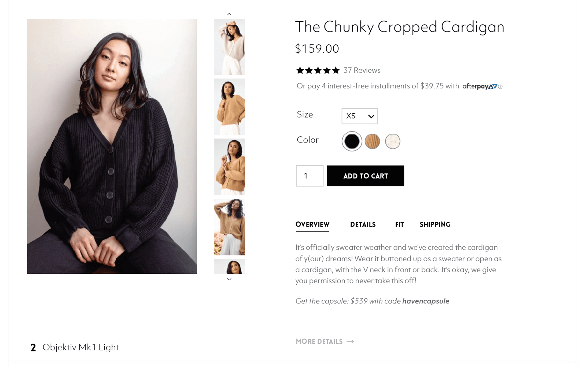
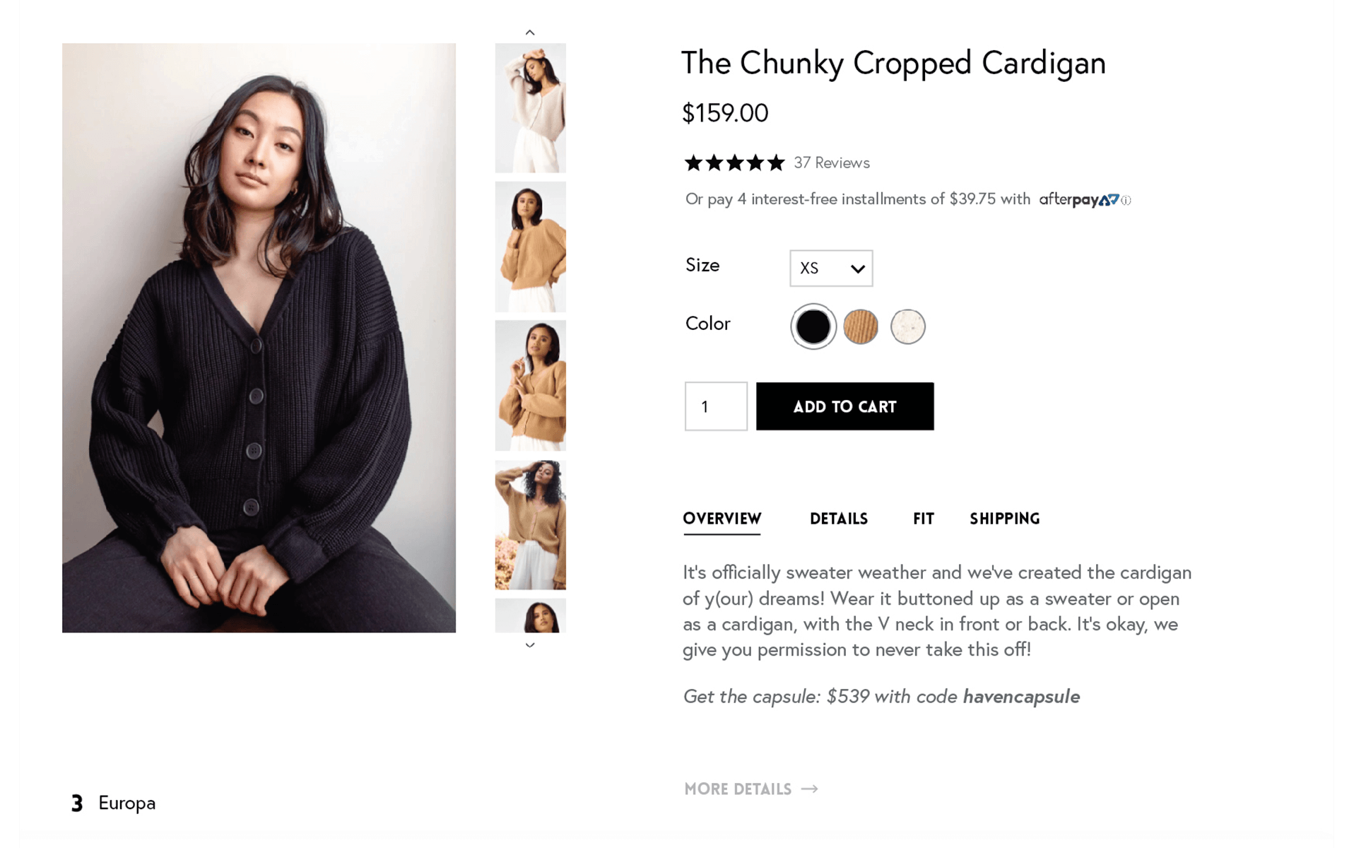
Using a combination of my observations from other sites and already successful Vetta brand elements, I mocked up some web and marketing components to see what styles pushed Vetta toward its brand goals.

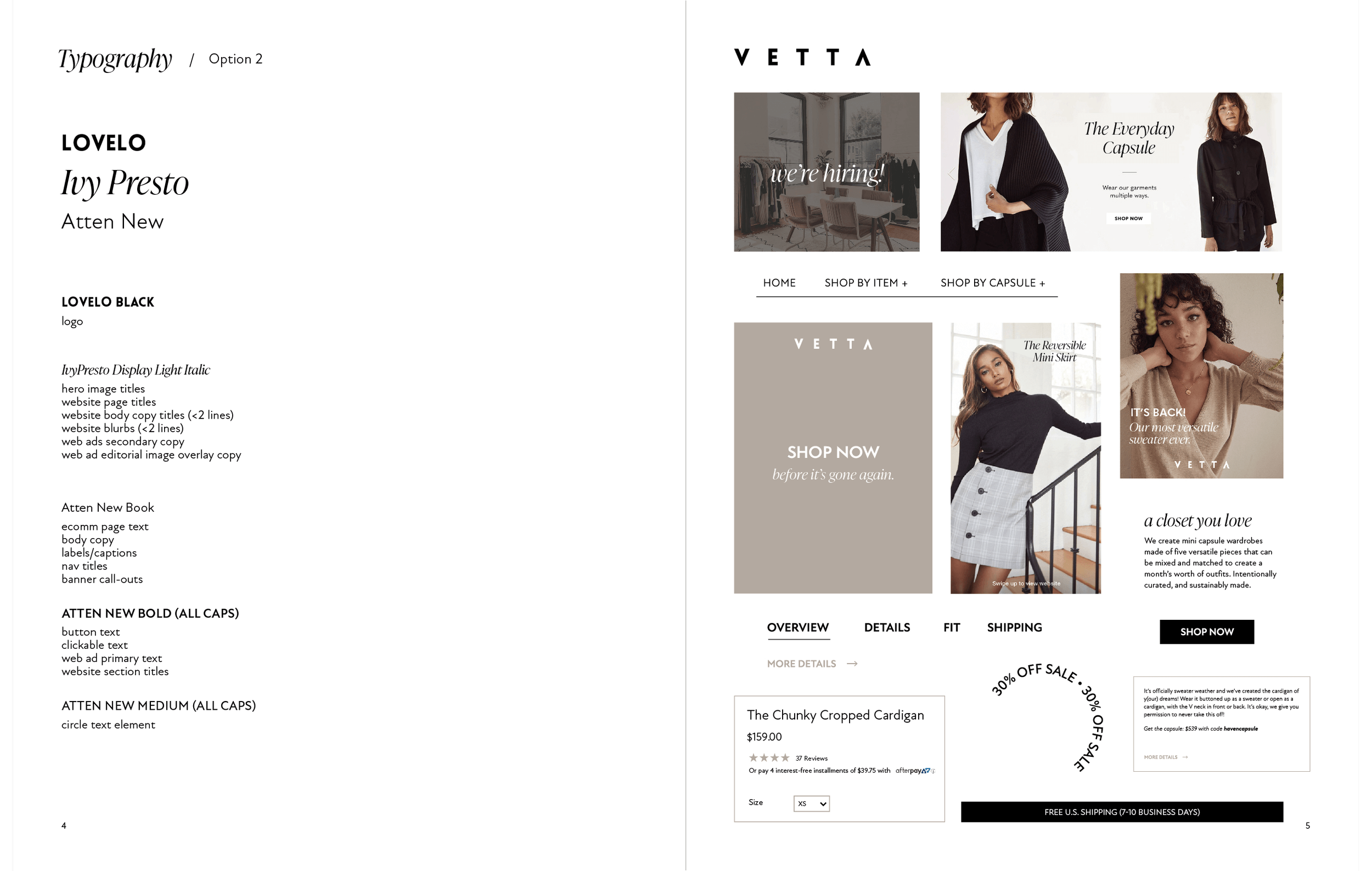
Font & Color
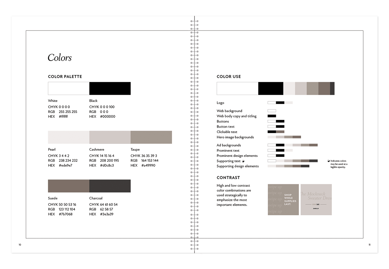
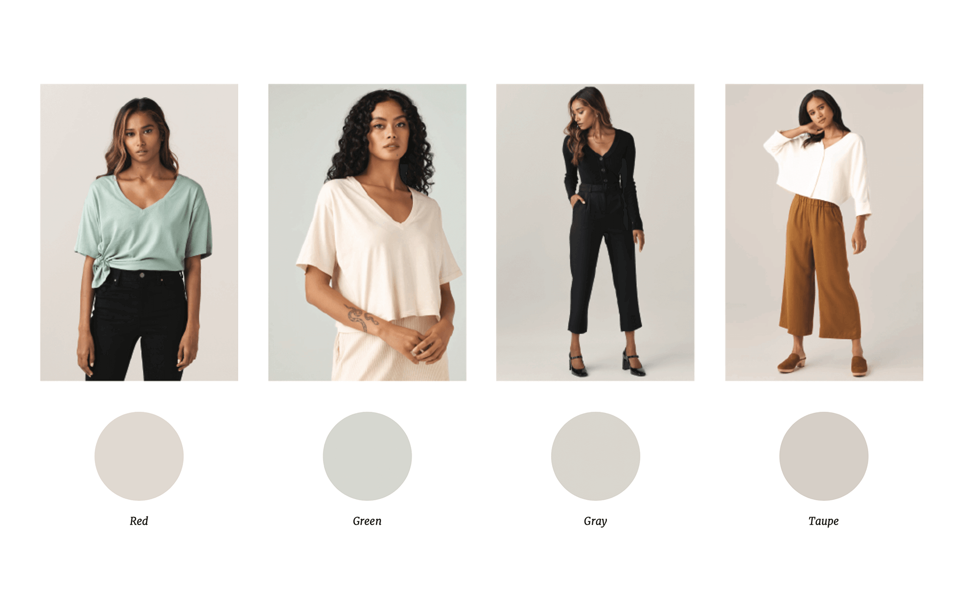
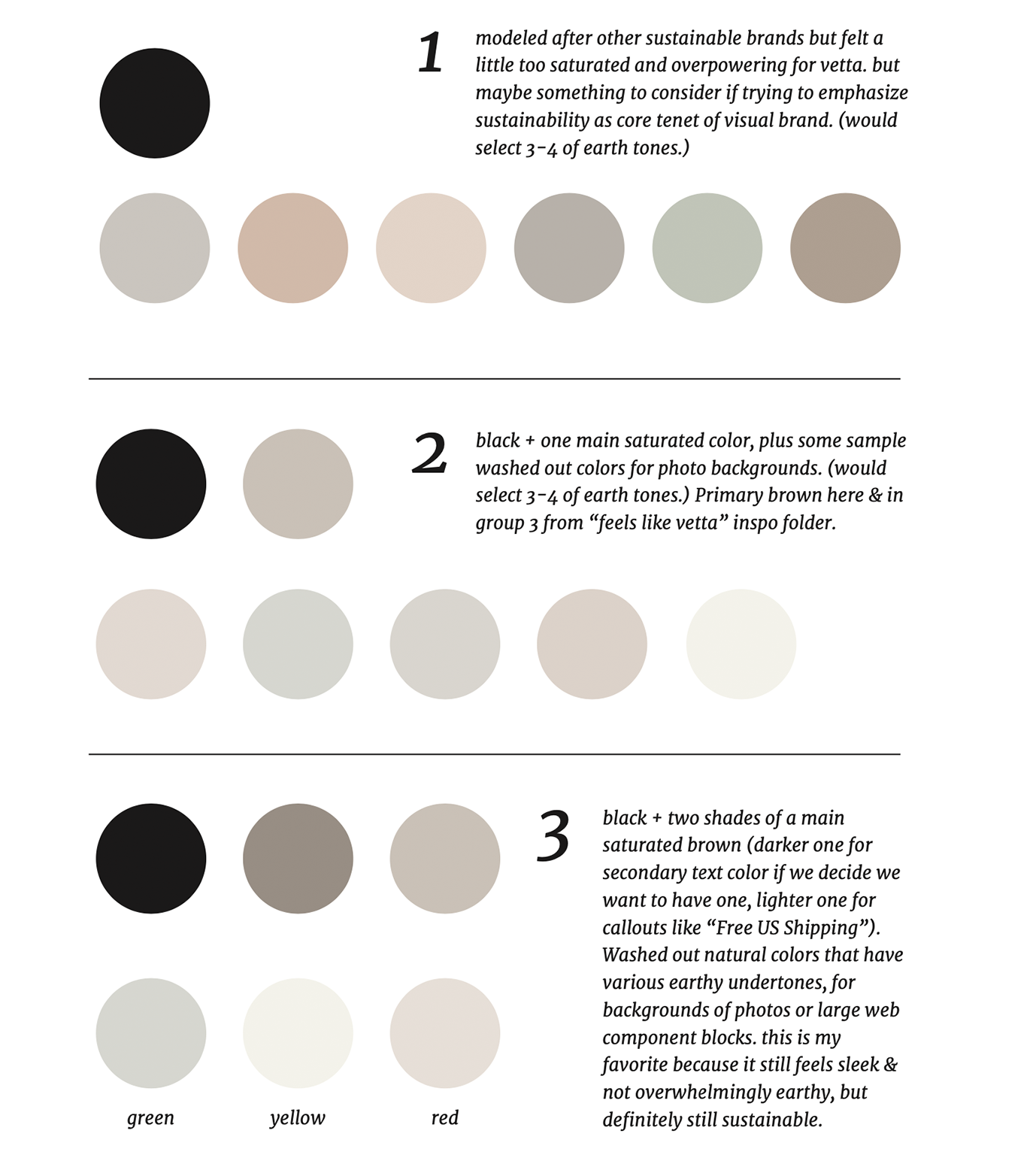
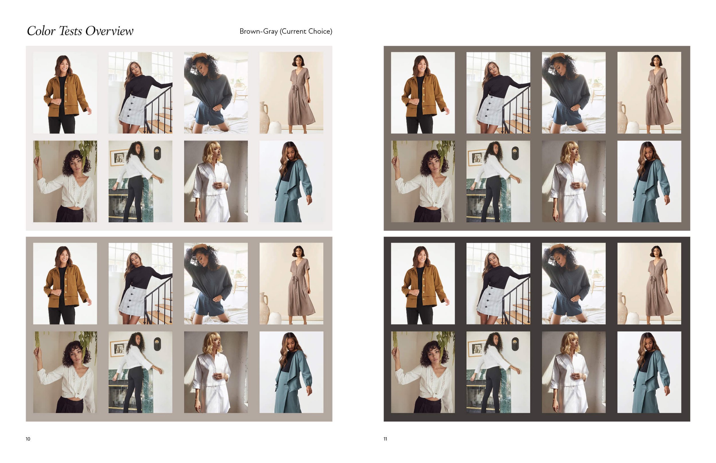
We knew we wanted warm neutral colors, so I created a few different groups of gray-browns to consider before forming a color palette. I also took into account what colors would look good with photoshoot backdrops, as well as which would look good as the backdrops themselves.
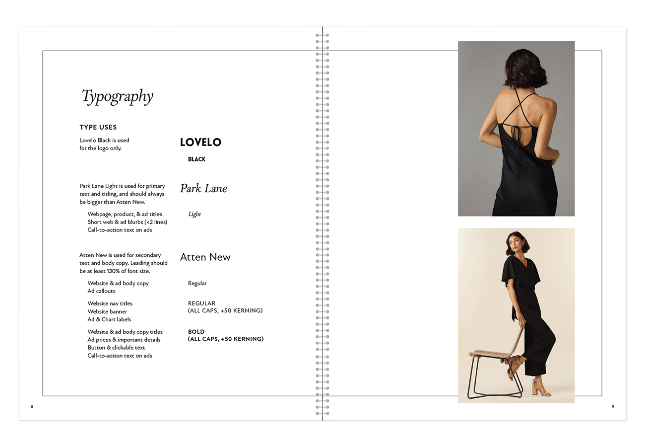
For typography, I wanted to move away from Montserrat in favor of something more elegant and mature. I mocked up a sample product page with various font options to see them in context.

Brand Proposals
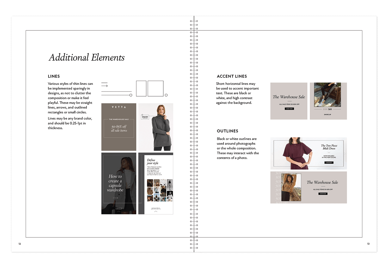
After honing in on a more specific group of fonts and colors, I made a more comprehensive brand proposal with options shown in context. This included testing various editorial and e-comm images on all the proposed colors, as well as proposing supporting brand elements.

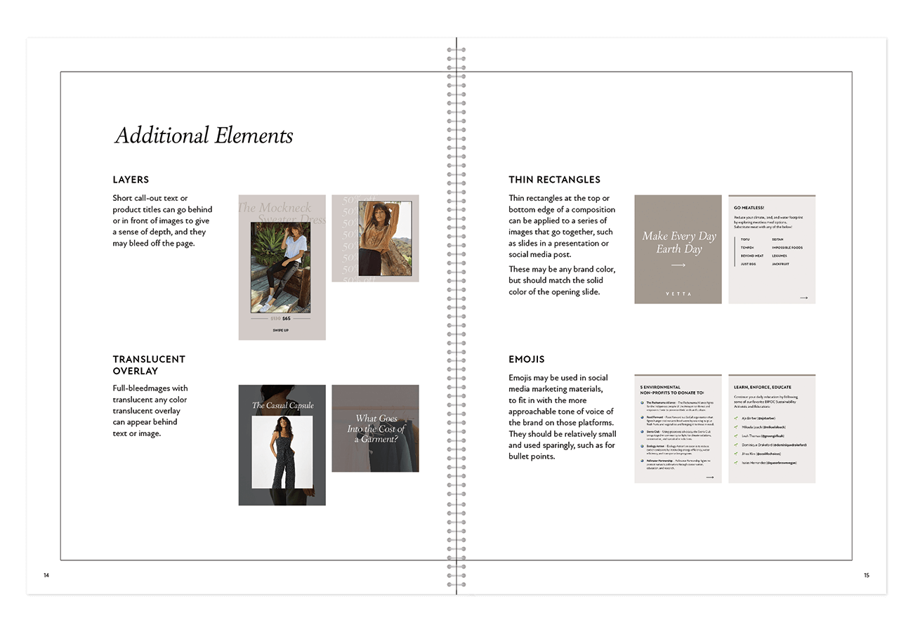
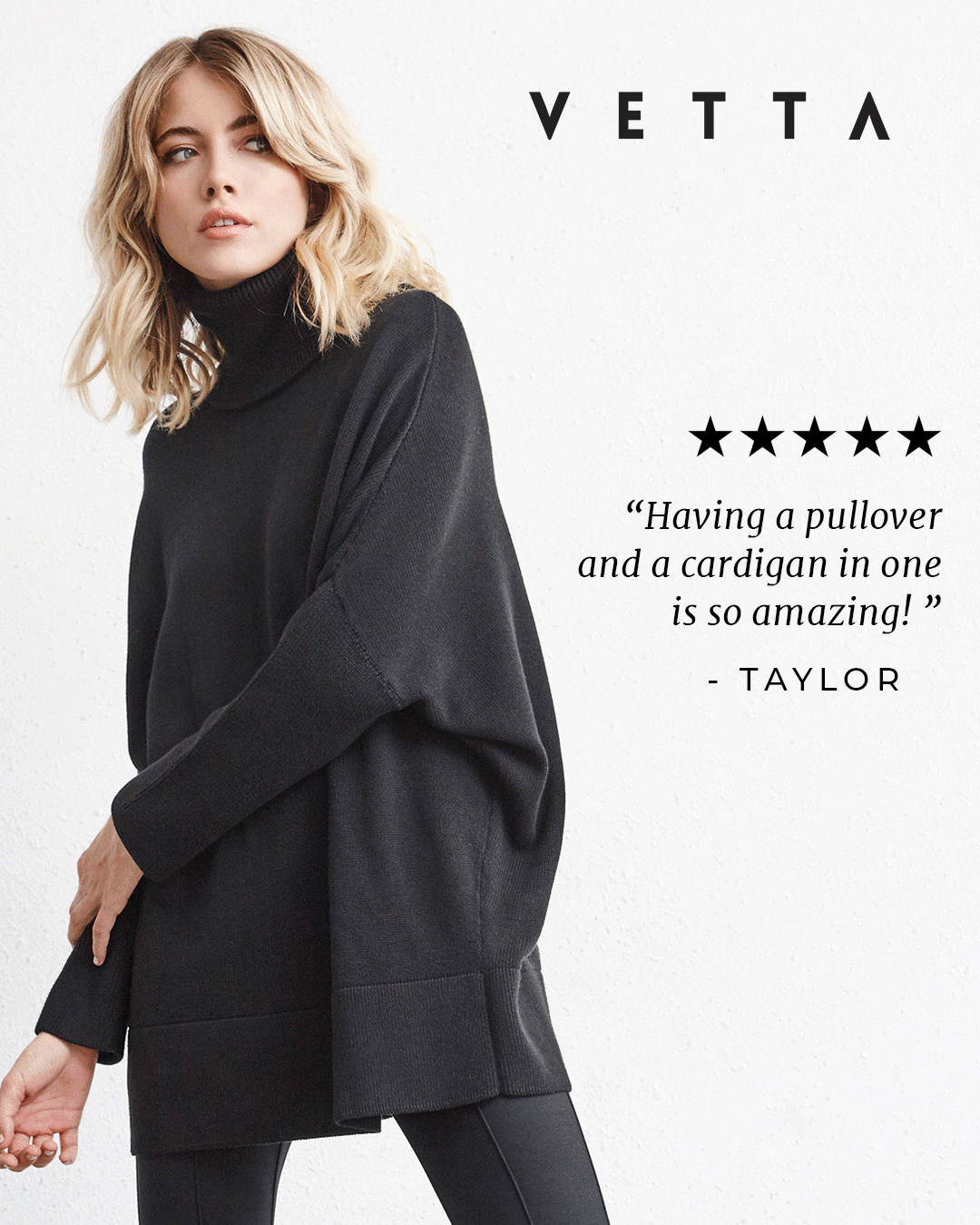
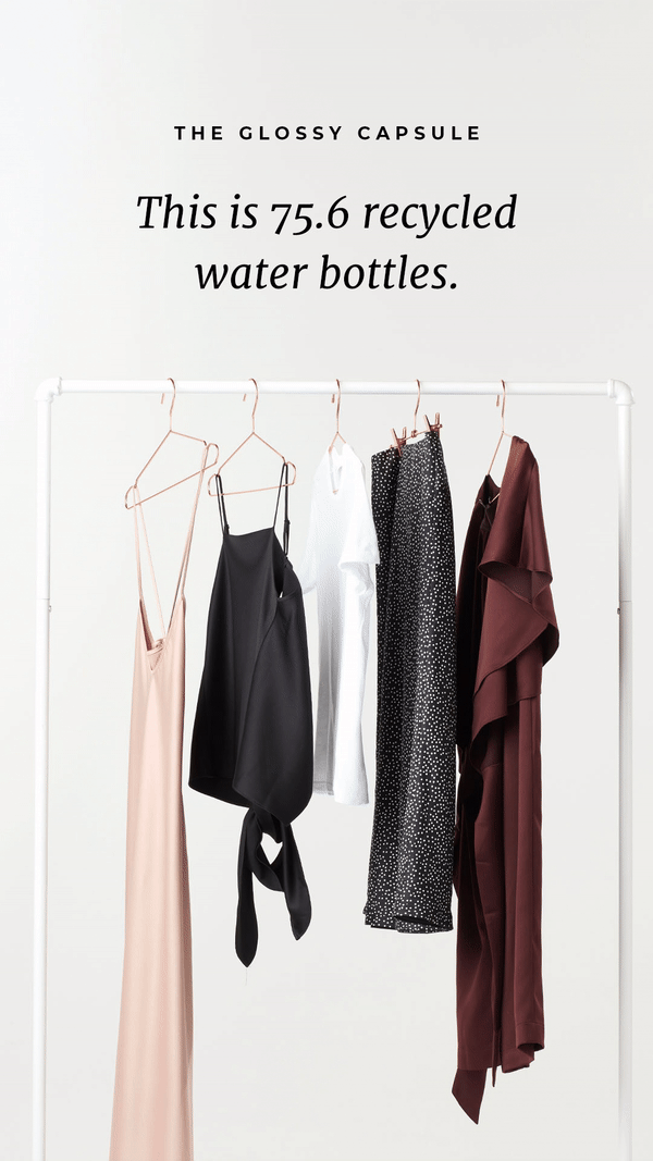
Final Brand Guide