RoomM8
A website with a customizable dashboard to manage household responsibilities and avoid roommate conflict, geared towards college students and young adults working from home.
Web prototype created for an Interaction Design course taken remotely in Fall 2020.

Discovery
Through a variety of exercises, including user personas, user task/goal charts, and interviews with target audience members, I identified the area I wanted to address. I chose the increased conflict of roommates during the pandemic due to most activities becoming remote.
Some notable pain points included:
Food prep is noisy while others are on a call or in class
Workouts more difficult because less space and noise disruption at early hours
Practicing instruments disturbs roommates who might be working/studying
Overall more overlapping at home, can get in each other’s way
I established that an important part of my site had to be a scheduling tool for roommates.
Target audience interview with my roommate at the time, Karisma, a part-time remote college student and remote employee.
Process
Lo-fi Wireframes
Initial wireframes for a top priority workflow: adding an event to a shared calendar.
Lo-fi digital wireframe for dashboard homescreen.
Prototype
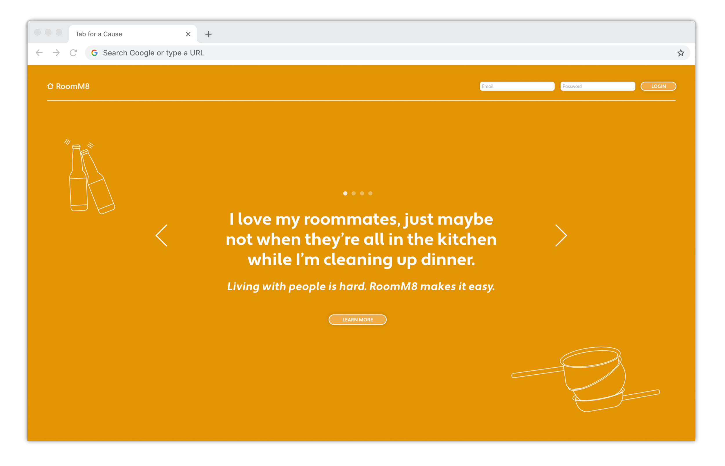
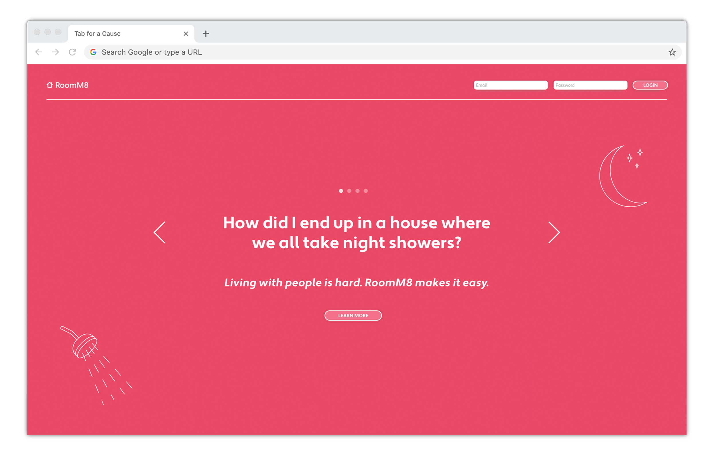
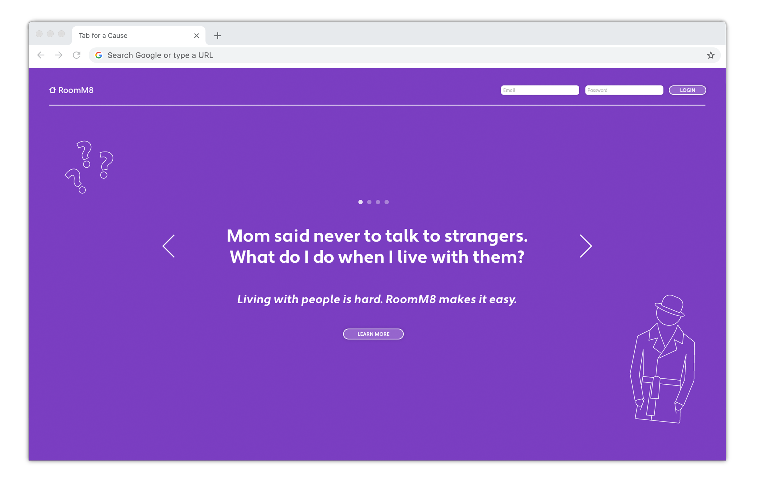
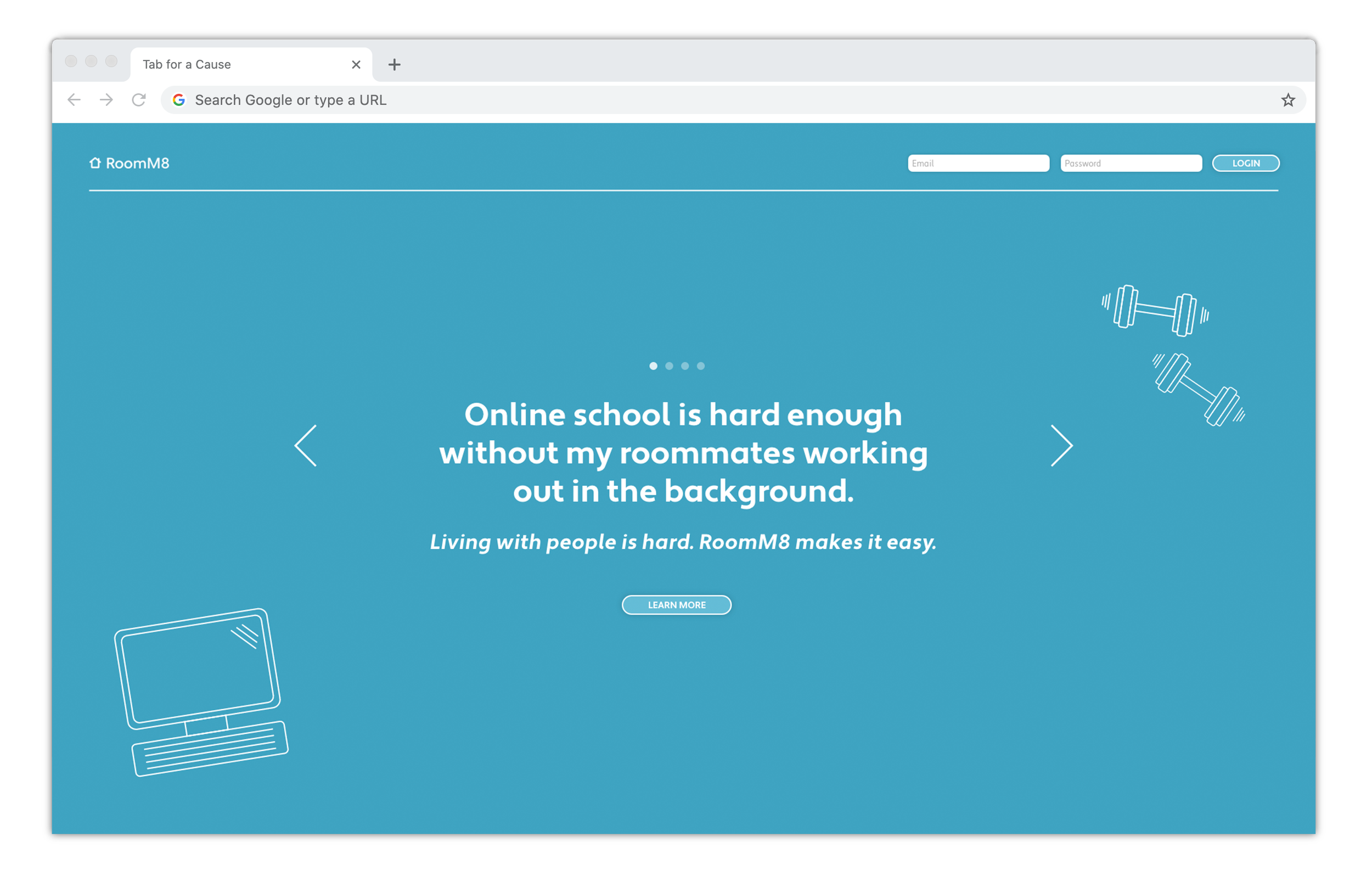
Landing Page
The landing page has an automatic carousel exemplifying a variety of relatable situations RoomM8 addresses. The carousel of screens also immediately introduces the idea of variety and customizability.
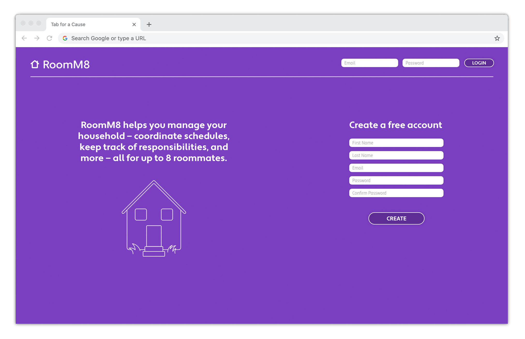


Create Account
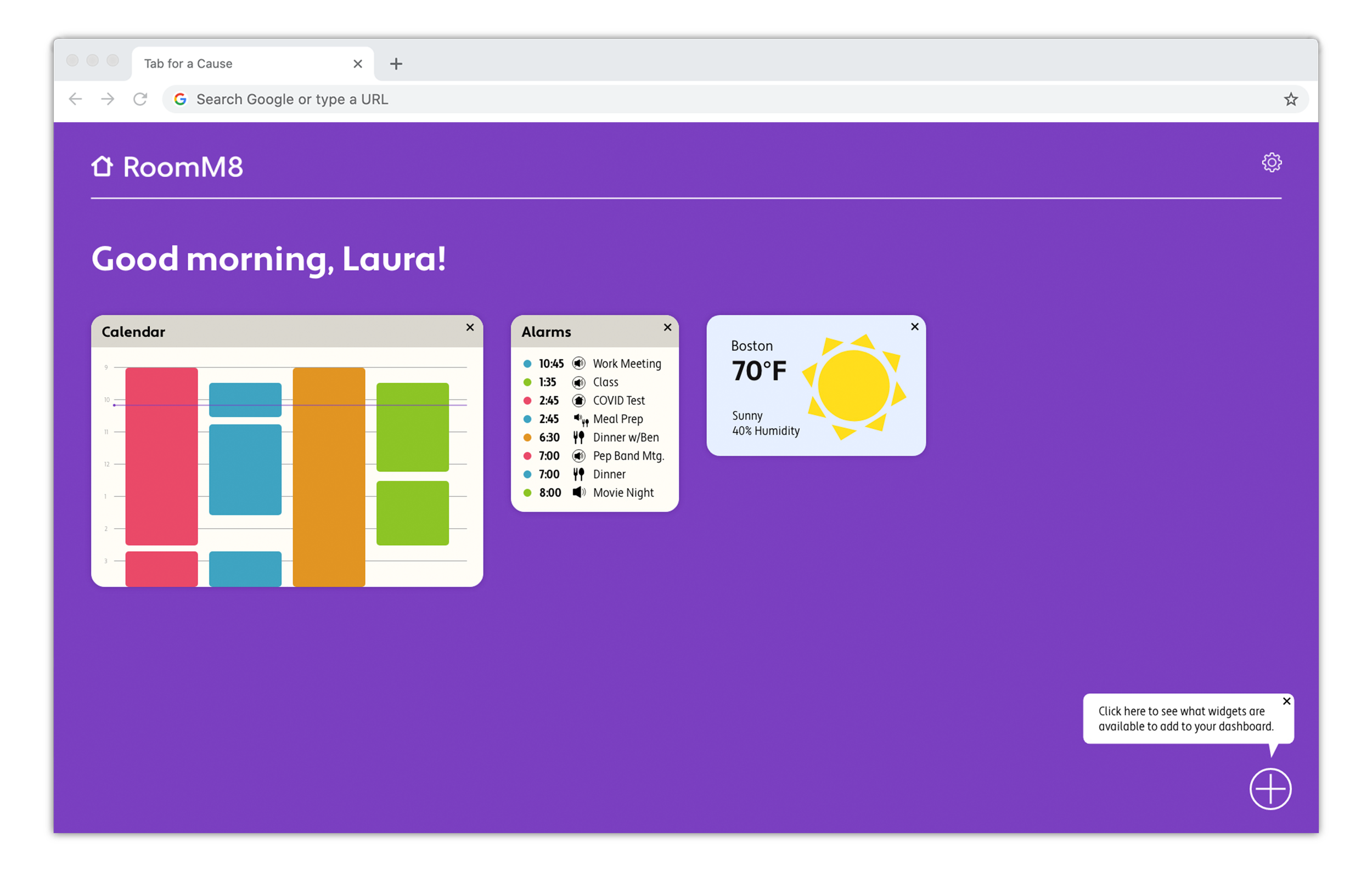
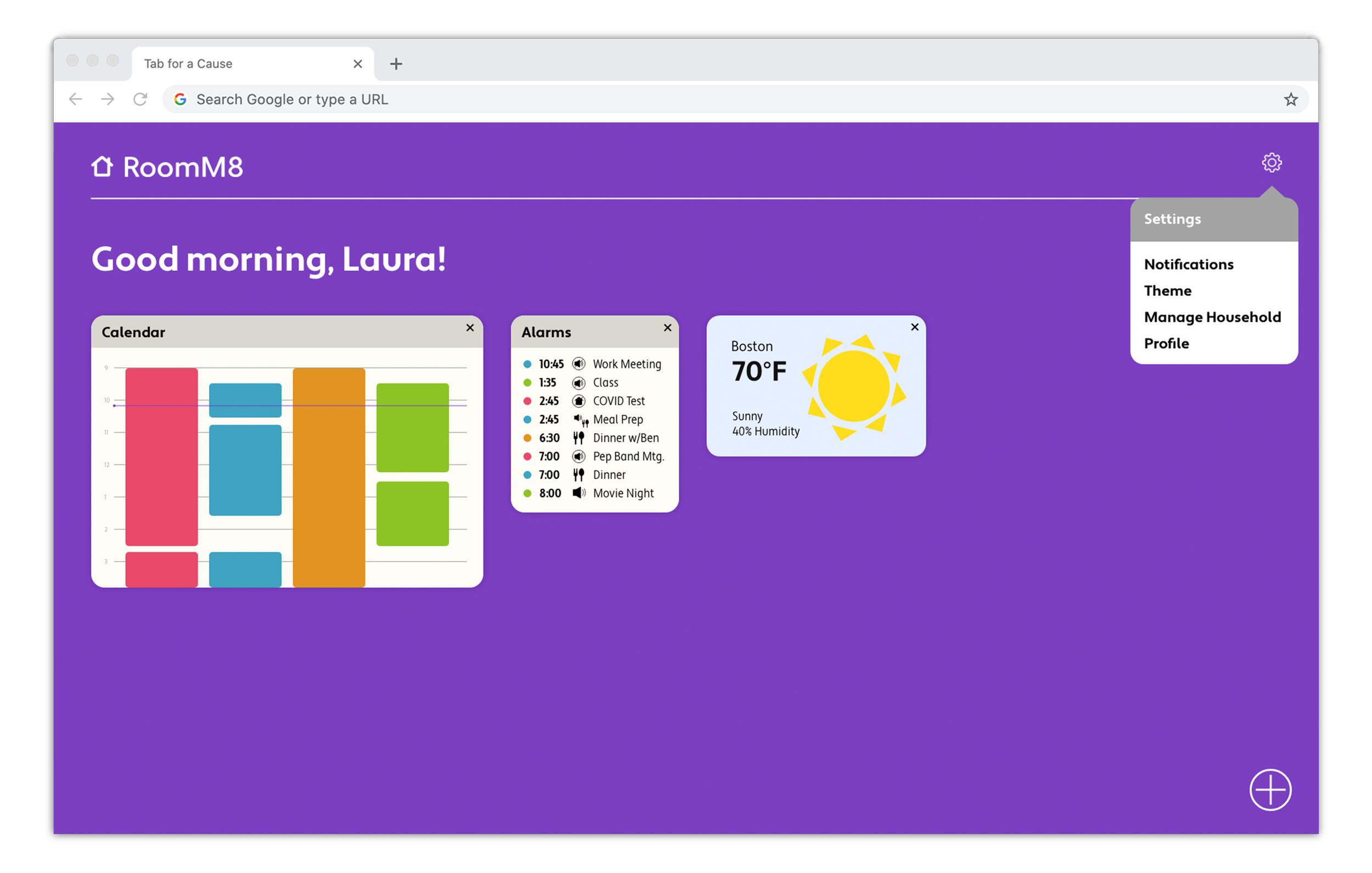
Homescreen (Dashboard)
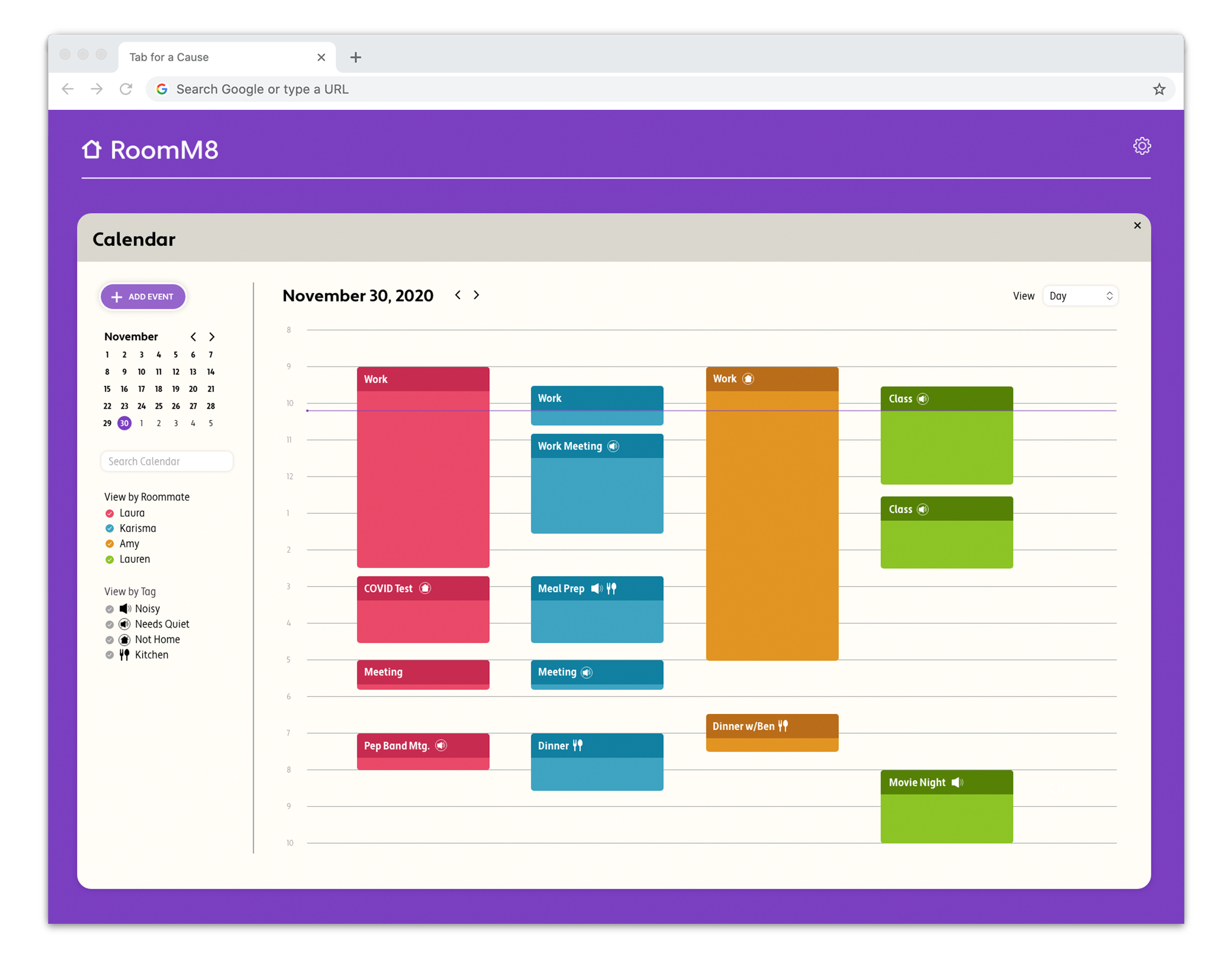
Each roommate chooses a color to represent themselves on their household’s account. This color is used for anything tied to their schedule — calendar events they create, and alarms that pertain to those events. This system helps users recognize immediately upon seeing their dashboard which roommate has needs that must be accommodated.

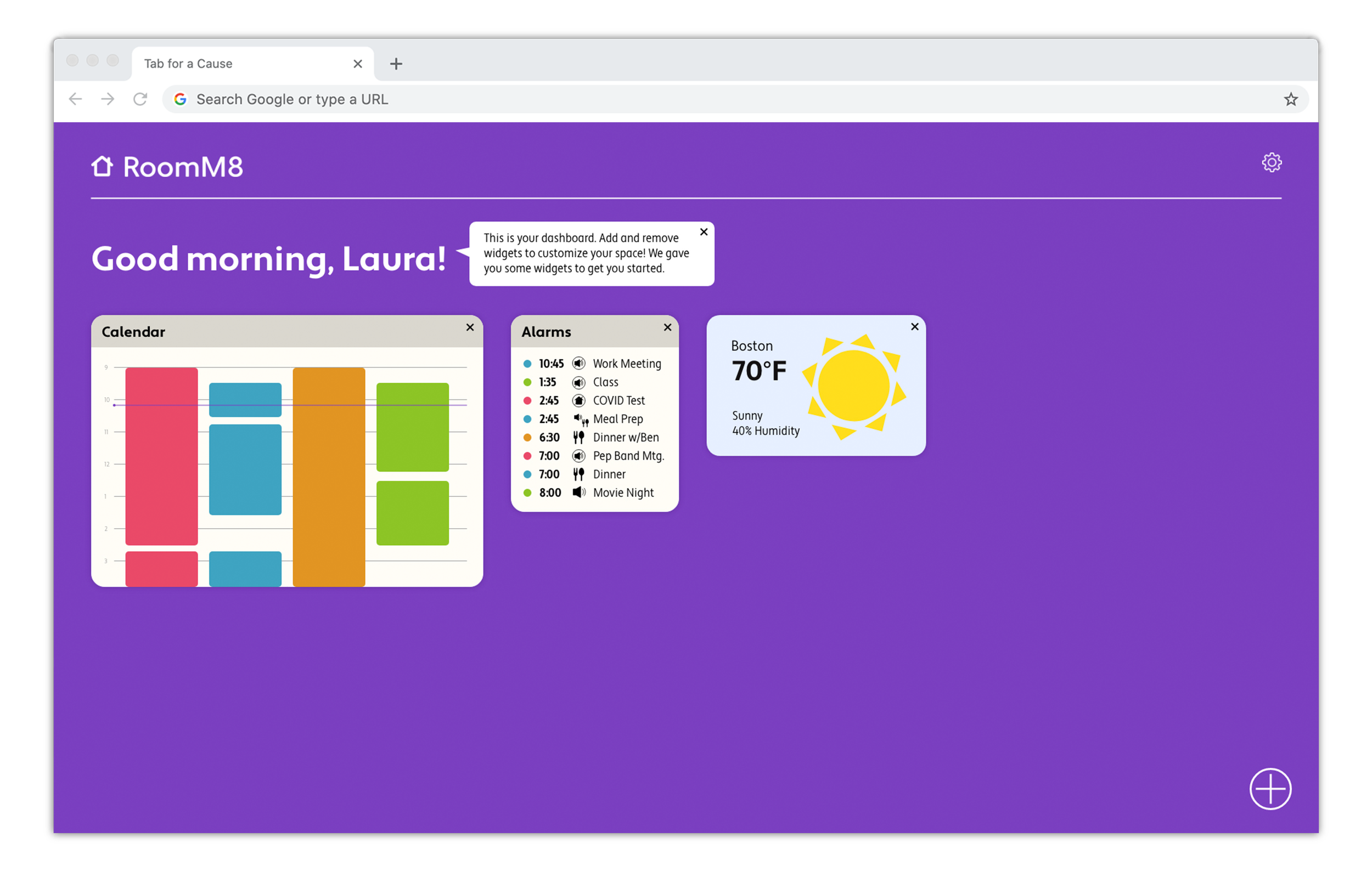
Calendar Widget

Mobile Prototype
Due to the nature of this website as a dashboard, the mobile version has limited functionality. However, it has several responsive workflows that enable users to view the most important scheduling information they would need if they’re on the go.
To see the prototype demonstration, click here!
Branding
Typography
Apertura is clean, approachable, and versatile. Apertura Condensed is legible and clean for smaller body text and widget details.

Logo
The logomark is a simple house, whose lines mimics the line quality of RoomM8’s typeface, Apertura. The type in the logomark also has rounded corners to feel softer and friendlier.

Color
Each user chooses a distinct bright color to represent themself in their household’s account. These are also used as webpage backgrounds.

Illustration
Illustrations contribute to the inviting nature of the site so that RoomM8 doesn’t seem like a stoic platform intended only for households that already have conflict; it should feel like a welcoming, helpful tool for communication in any household.
